
Composition has Two Jobs
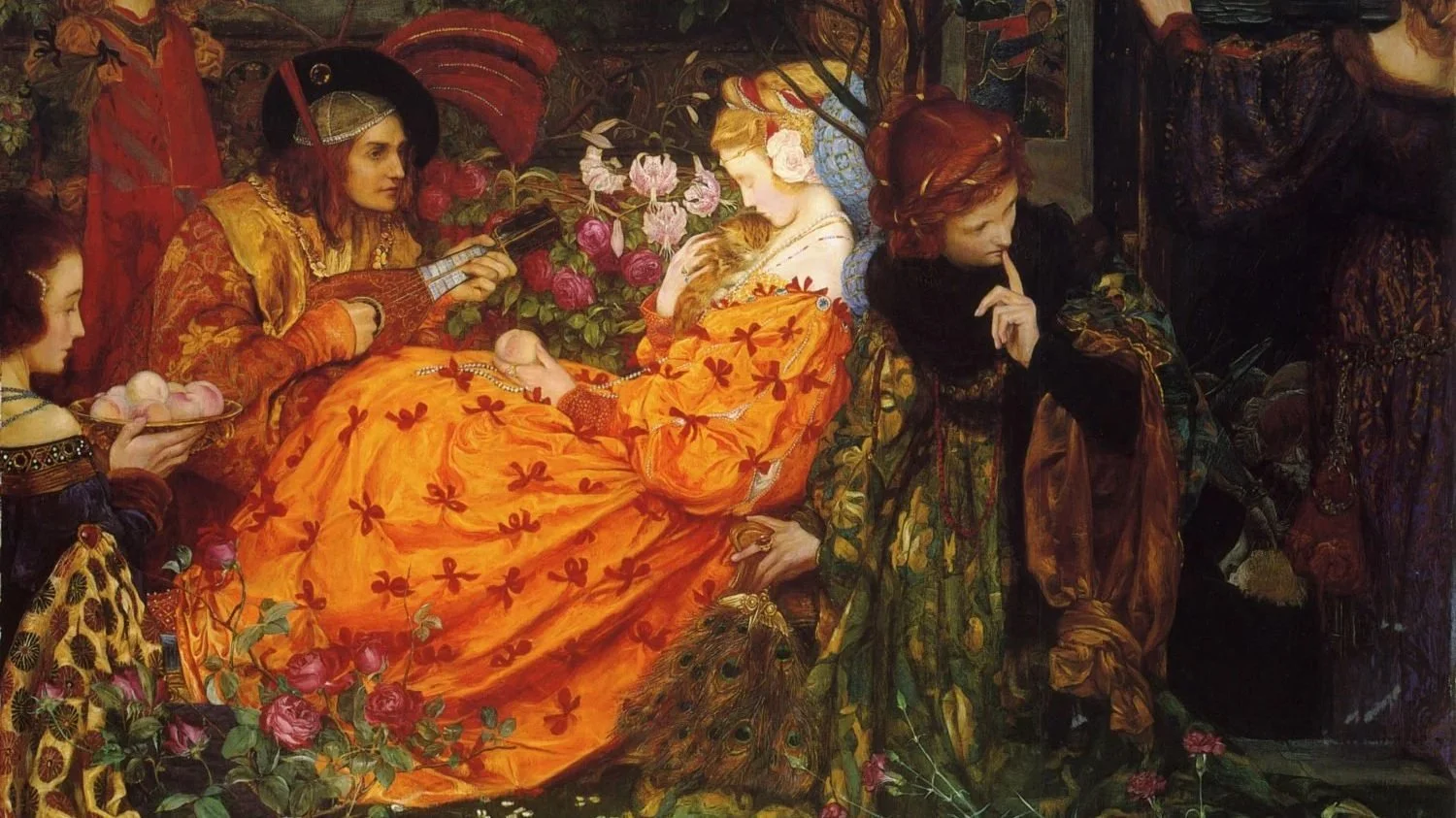
(detail) The Deceitfulness of Riches by Eleanor Fortescue-Brickdale
Composition has two jobs.
Well, really, composition has one job: to make shapes interesting.
But let’s focus in a little further and say that it has two more specific jobs:
Catch your attention from a distance.
Reward you up close.
Can you relate to either of these experiences?
You’re standing in the center of a large gallery, surrounded by walls of paintings. One particular painting catches your eye from across the room. You move in to investigate and—
…it’s a little disappointing.
It was better at a distance.
Or maybe you stumble upon a painting with really interesting brushwork and beautiful little details. You’re glad you found it—but you nearly missed it entirely. And somehow the painting doesn’t feel quite held together. It feels flimsy. Unanchored.
These are two examples of paintings that are halfway working.
One has impact, but not intimacy.
The other has intimacy, but not enough impact to bring you in.
If it sounds daunting to construct a painting that doesn’t fall short in either respect, you’ll probably be happy to hear that there are specific strategies you can use to do each job well.
Job One: Catch Attention From a Distance
VALUE, VALUE, VALUE.
Really.
Our visual systems are designed to respond to light and dark before color, and to large shapes and directional movement before detail.
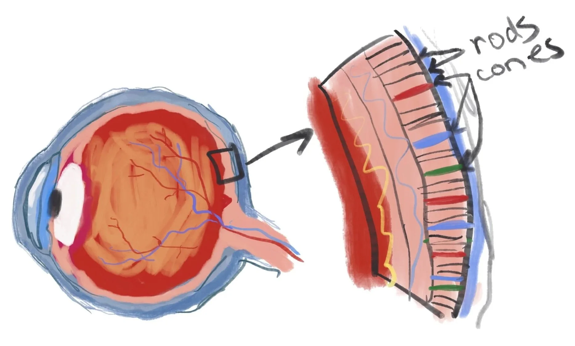
The retina contains 2 types of photoreceptive cells- Rods, and Cones. There are roughly 120 million rods that register light, dark, movement, and peripheral information, but not color. They help us identify objects, place them in space, and avoid walking into—or off of—something dangerous.
Interestingly, we have only a 6 million cones that register color and detail. In other words, the primary function of your brain is not to serve you the richness and detail that we enjoy visually (and we do enjoy it!), but it’s by far secondary to the project of keeping you alive and in one piece.
So if you can create a composition that compels the brain to investigate (is that big shape over there a threat?) and identify a pattern of large value shapes, you are already in pretty good shape.
You can do this with:
clear light-and-dark organization
strong contrast
asymmetry
diagonals and changing angles
interruptions in a repeated pattern
one dominant shape supported by smaller shapes
enough simplicity that the structure can be understood quickly
The brain loves angles. Angles suggest movement, direction, change, and potential instability. A horizontal line feels settled. Tip it, and suddenly something may be happening. This works because of our real world experience with gravity, and because our brains actually have more cells tuned to recognizing stable shapes like verticals and horizontals than diagonals- they’re easier.
Contrast works similarly. The eye naturally moves toward areas of greatest difference: light beside dark, sharp beside soft, saturated color beside neutral color.
But at a distance, value usually wins.
Squint at your painting. Step across the room. Turn it into a tiny thumbnail on your phone. If the large shapes disappear, detail is probably carrying more of the painting than it should-
And detail is not a heavy lifter. Not from across the room.
Job Two: Reward the Viewer Up Close
Once the painting has done enough to bring someone closer, the job changes.
Now the viewer can see things that were unavailable at a distance:
brushwork
edge variety
shifts in temperature
subtle expressions
small shape relationships
texture
symbolism
passages that dissolve and re-form
evidence of your decisions—and perhaps your uncertainty- in other words marks of human-ness
Detail for detail’s sake is short lived.
A painting can contain endless little brushstrokes, photo realistic appearance, and still have very little to discover.
Reward comes from relationship, hierarchy, variation, and meaning. In other words- storytelling.
This can be literal in the sense of a highly narrative painting, or much more subtle.
The point is- give the people something to wonder about.
Maybe a face is mostly obscured. Maybe the emotional center of the painting is not the same as the area of greatest contrast. Maybe a figure is reacting to something just past the frame. Maybe the paint is left in a somewhat unfinished state- allowing the viewer to participate in the painting process subconsciously.
Maybe the viewer begins to notice that the story is less certain than it first appeared.
If everything is explained immediately, there may be no reason to stay with a painting.
Consider restraint- Less information, less polish, less certainty can certainly be more.
Impact and Intimacy
These two jobs are related, but they are not identical.
A painting with strong impact says:
Look at me.
A painting with intimacy says:
Stay with me.
The best paintings do both.
They offer a large, compelling visual structure from a distance—and then become richer, stranger, more human, or more beautiful as the viewer moves closer.
So when you are evaluating a painting, try asking:
Does it organize itself clearly from across the room?
Is there a compelling arrangement of large shapes?
Does the value structure create enough visual tension or clarity to bring me in?
Once I approach, does the painting deepen—or merely become more detailed?
Have I left anything for the viewer to discover?
Composition is not only about directing the eye toward a focal point.
It is about designing the viewer’s experience over time. That experience might not be a high energy, high conflict - attention demanding painting. Make sure that even if you are using less contrast, calming horizontals, and more harmony- that every element you choose supports that emotion. The brain may enjoy the rest it provides. But even so, give it something to think about- gently.
First, the invitation.
Then, the reward.
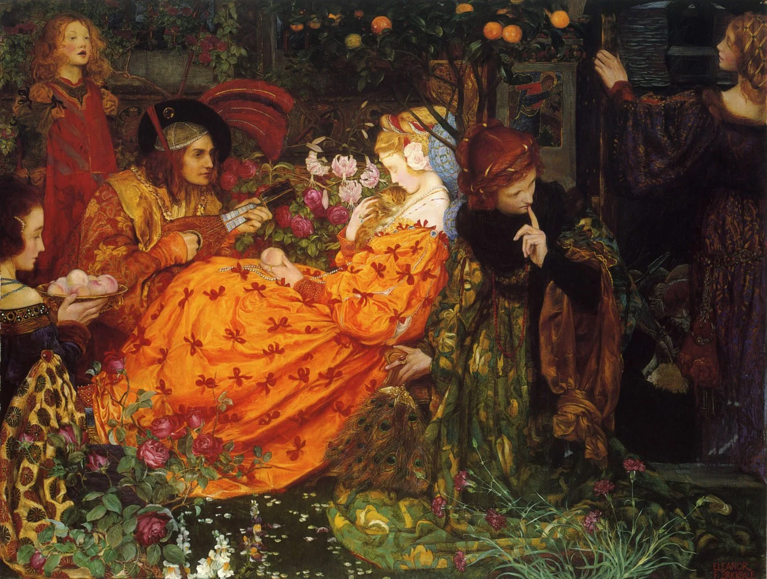
The Deceitfulness of Riches by Eleanor Fortescue-Brickdale